Business management is complex by nature, and this is why most businesses tend to fail in today’s evolving and competitive market. However, when you are handling a business, it is highly required that you keep in touch with its ongoing success, pain points, and the prospective challenges that are coming your way. The best strategy to gain this understanding is through ‘Data Visualisation’, one of the main strategies you encounter in the business management arena.
In this article, we will be exploring what data visualisation in business management is and the types of data visualisations that can be utilised by Project Managers.
In this article, we will discuss:
3. Enhancing Communication through Data Visualisation in Business Management
What is Data Visualisation?
- Data visualisation in business management refers to the graphical representation of complex data sets and information to make the responsible parties understand the real-time situation of the business. It can be known as a transformation of raw data into easy-to-understand visual formats like charts, graphs, dashboards, or maps.
- These visualisations provide a simple and effective way of quickly and efficiently processing vast amounts of data. Data visualisation helps in decision-making, finding insights, and explaining complicated ideas to people in a company by providing trends, patterns, and connections visually.
- It improves understanding, making information easier for stakeholders to understand and use in strategic planning, performance tracking, and actionable insights.
- In the end, data visualisation gives businesses the ability to draw insightful information from their data, supporting better-informed and efficient decision-making procedures.
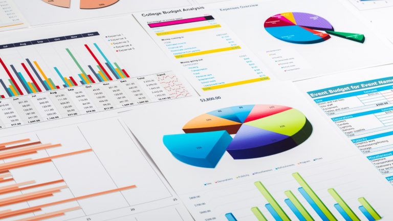
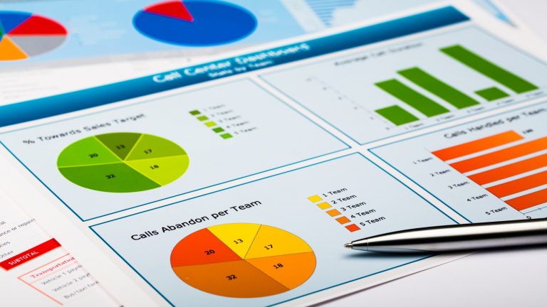
Types of Data Visualisation in Business Management
Gantt Chart
A Gantt chart is a visual representation used in business management to display project schedules.
It presents tasks or activities as bars along a timeline, showing their start and end dates.
This chart helps with planning, scheduling, and work tracking by providing a clear picture of project progress, dependencies, and deadlines. Companies use Gantt charts to successfully manage timetables, assign resources, and update stakeholders on the progress of their projects.
Its visual style makes complicated data easier to understand, empowering teams to decide sensibly and grasp project schedules, which enhances project management.
Column Chart
This is another fundamental data visualisation tool in business management that presents data in vertical bars to compare quantities across different categories. It is a clear view, as each column’s height represents the value it represents, offering a straightforward visual comparison between various data sets.
We can see this is mostly used to showcase trends, identify patterns, and make informed decisions based on the comparative analysis of data points.
Column charts effectively show differences in the data, making it easier to identify patterns or exceptions. This helps companies get an understanding and make strategic decisions for planning and performance that maximise results.
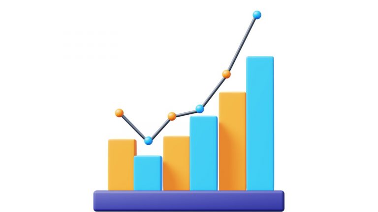
Line Graph

A line graph is a quite valuable data visualisation tool in the business context that displays information as a series of data points connected by lines.
It is perfect for showing ongoing data sets or connections between variables, as it shows trends, patterns, or changes over time.
Line graphs are mostly used in business to monitor revenue patterns, performance measures, and market swings over a certain period.
This graphic display makes complicated data easier to understand, making it easier to identify trends, speed up decision-making, and direct strategic planning based on periodic or evolving patterns.
Pie Chart
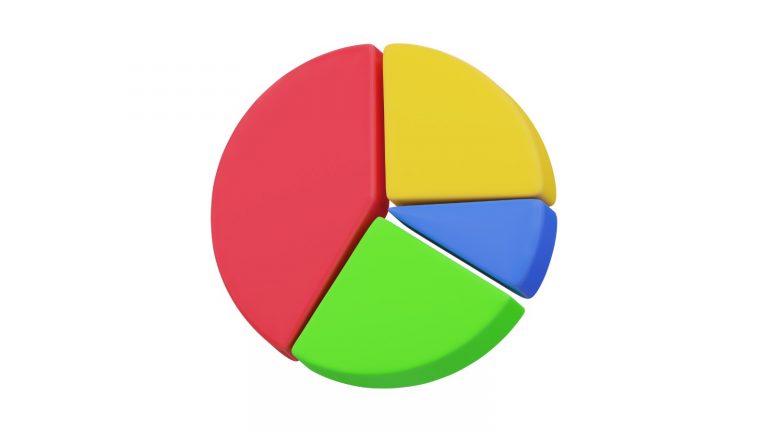
This chart is commonly used to show some proportions or percentages of a whole. It looks like a circle that has been divided into sectors; every single one of them stands for a separate group or portion of the total.
Pie charts make it simpler to quickly see distributions or relative dimensions by clearly showing how each component contributes to the whole dataset.
They are quite useful in business management for showing budget allocations, market shares, or sales composition since they give a fast overview of relative proportions within a dataset.
Bar Chart
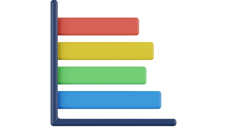
This is a graphical representation used in various businesses to display data with rectangular bars, each representing categories or discrete data points.
It is straightforward to visually compare numbers across multiple categories since the bars’ lengths and heights match the values they represent.
When comparing, displaying patterns, or illustrating changes in data over an extended period, bar charts are quite useful. They support making choices and strategic planning in the company by providing a clear, brief perspective of data to analyse sales numbers, market trends, or performance measures.
Heat Maps
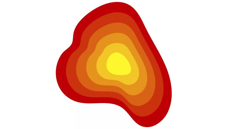
This uses colour gradients to represent values across a matrix or grid to offer a comprehensive view of complex data by assigning colours to different values, making patterns or variations easily understandable.
Usually, in business, heat maps are employed to analyse website traffic, customer behaviour, or market trends geographically or categorically. They offer quick insights into high- and low-performing areas, clearing the way for businesses to identify strengths, weaknesses, or emerging trends efficiently.
Heat maps are quite beneficial when it comes to decision-making because they highlight areas requiring attention and inform strategic initiatives based on visual intensity representation.
Scatter Plot
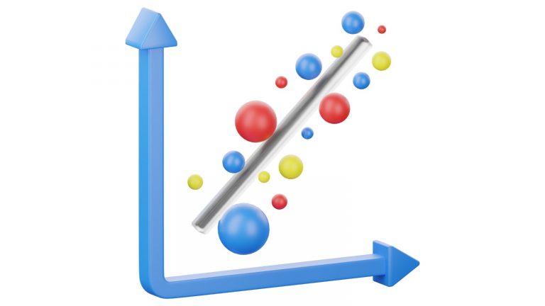
In business management, a scatter plot is a graphical tool that shows the relationships between two variables. Each dot on the Cartesian surface is a representation of a data point, and its placement is decided by the values of the two variables that it relates to.
Scatter plots showcase patterns, correlations, or trends between variables, helping businesses identify potential cause-and-effect relationships or dependencies.
They are essential to business when it comes to evaluating marketing data, studying the effects of factors like pricing and demand, or exploring links between consumer demographics and purchasing patterns.
Bubble Chart
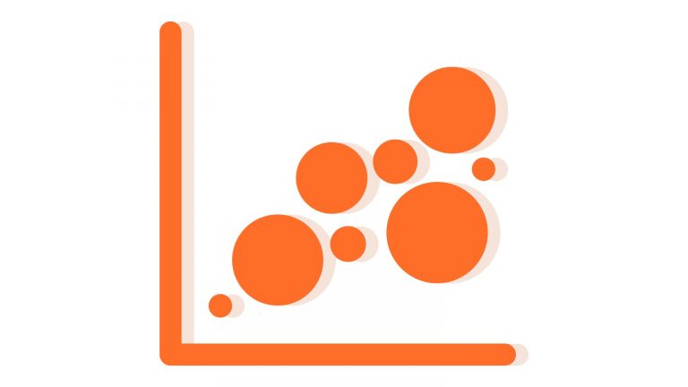
A bubble chart is a dynamic data visualisation tool used by PMs that extends the principles of a scatter plot.
It represents three dimensions of data by displaying points as bubbles on a graph, where the position on the axes reflects two variables and the size of the bubble indicates the third variable.
This chart helps illustrate relationships between variables and showcases additional information through varying bubble sizes, enabling businesses to visualise and analyse complex datasets with multiple dimensions.
Bubble charts are useful in business for showing data with multiple variables as they highlight links and shifts across numerous aspects at once, which helps with decision-making.
Funnel Chart
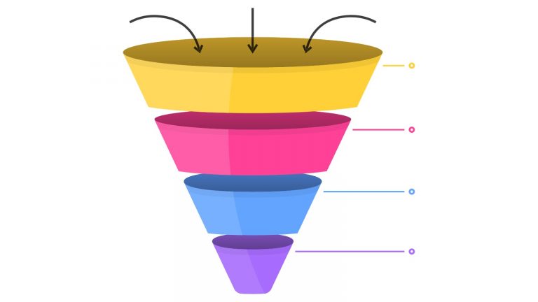
These are employed to show phases in a procedure or a steady decline in data at each phase. It represents the flow through various stages of a bigger group to a smaller subset, like a funnel.
Each section’s broadness usually corresponds to the amount or ratio at that point.
Funnel charts are useful for visualising client acquisition, conversion rates, and sales funnels as they provide information about possible bottlenecks and drop-off points, which helps companies improve efficiency throughout the process.
Radar Chart
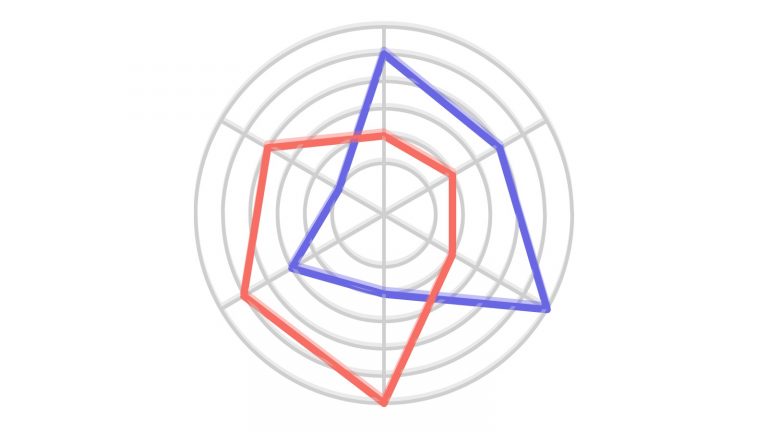
A radar chart, also known as a spider chart or web chart, is a data visualisation tool used in business management to display multivariate data on a two-dimensional plane. It consists of a series of axes radiating from a central point, with each axis representing a different variable.
The data values for each variable are plotted along the respective axes, and the resulting points are connected to form a polygon, which offers a visual comparison of multiple variables accordingly.
These radar charts help analyse strengths and weaknesses across various dimensions, making them useful for performance assessments, comparative analysis, and some evaluations.
Tree Chart
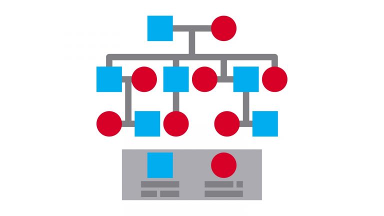
A tree chart, also known as a tree diagram or tree structure, is a hierarchical data visualisation tool used in business management to illustrate relationships, structures, or classifications.
It shows connections and levels of categories, subcategories, or items coming from a single node at the centre, much like a branching structure.
Tree charts provide a visual representation that makes complicated interactions easier to understand, making them useful for organising and illustrating project breakdowns, administrative structures, and decision-making processes.
They help in understanding organisational frameworks, relationships, and categorisations in business, which makes communication and strategic planning easier.
Flow Chart
Its purpose is to show the order in which actions, procedures, or workflows occur inside a system. It makes use of a variety of forms linked by arrows to represent alternatives, actions, or inputs, showing how things flow from one stage to the next.
Flow charts provide an orderly summary of procedures, which helps in the understanding, examination, and enhancement of work processes.
They are essential in business for defining operating procedures, locating difficulties, or simplifying operations by showing the activities in the correct order, as well as for promoting effective communication and process improvement projects.
Enhancing Communication through Data Visualisation in Business Management
Since you have read this whole article, you must have understood that data visualisation in today’s business context is not a mere option; it has become a necessity for any industry that seeks new and creative ways to bring their business up the ladder of success. There are many data visualisation techniques you can employ for your business after carefully evaluating its nature, as not every strategy can provide you with the best outcome you expect. With the right data visualisation technique in place, you no longer have to worry about giving extended explanations to your stakeholders, as these charts themselves can speak thousands of words.