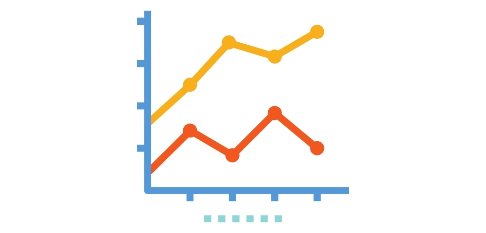
Do you think that a missed deadline in project management costs only money? What about the reputation, wasted resources and time then? We are not implying that managing a project is a simple task, as it may seem to be. It is the right balance between time, money and right administration. Not to mention that the margin for errors in this landscape is razor sharp! This is where the visual representations of each part are important, and project management charts stand out as the best visual tools you can implement in your projects.
This article covers everything about the seven most used project charts you need to know in 2025 and beyond.
We will explore
What are Project Charts?
- Project charts are illustrations used to show all the different elements of a project. Project managers require these charts to graphically display the data that they employ to oversee each part of a project.
- They are able to illustrate the connections among assignments, materials, employees, and due dates. Project managers monitor a project’s development and spot any possible issues with the use of project management charts.
- However, project managers utilise a wide range of chart varieties. While some cover a wide range of topics, others concentrate on specific project management elements like staff scheduling and responsibility.
- You could use one or more charts on each project as a project manager, and the secret to successfully managing projects of all sizes and sorts is understanding how to make a broad range of project management charts.
Types of Project Management Charts
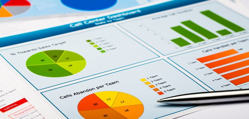
Bar Chart
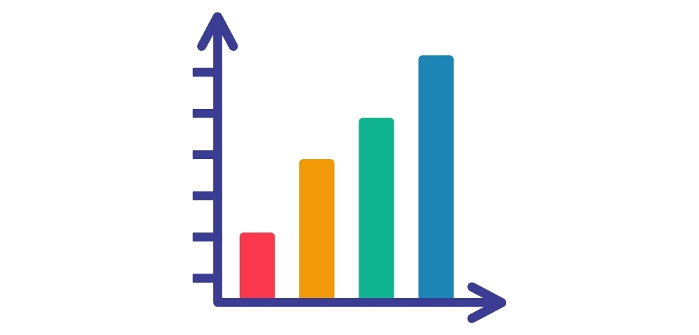
A project bar chart is a visual representation of the resources necessary to execute project tasks. Also referred to as a resource allocation chart, it is a useful tool for project managers to assist in spotting any issues with resource shortages or job dependencies.
A project bar chart’s primary benefit is that it lets you quickly identify the activities that are eating up the most resources, letting you better spend the time and energy of your team. If needed, you could use this information to renegotiate timeframes with stakeholders or clients.
Bar charts provide a high-level summary of all project operations and are simple for all project participants to grasp. Project managers frequently utilise bar charts because they are straightforward, adaptable, and simple to understand.
Project managers employ bar graphs to display a variety of statistics, such as the number of duties that have been finished alongside the ones that are still outstanding, as well as the billable and non-billable working hours. A bar chart is a type of data visualisation where two distinct categories are represented by the vertical and horizontal axes.
While it is possible to plot the bars on a horizontal bar chart both vertically and horizontally, the horizontal bar charts are far more common.
Gantt Chart
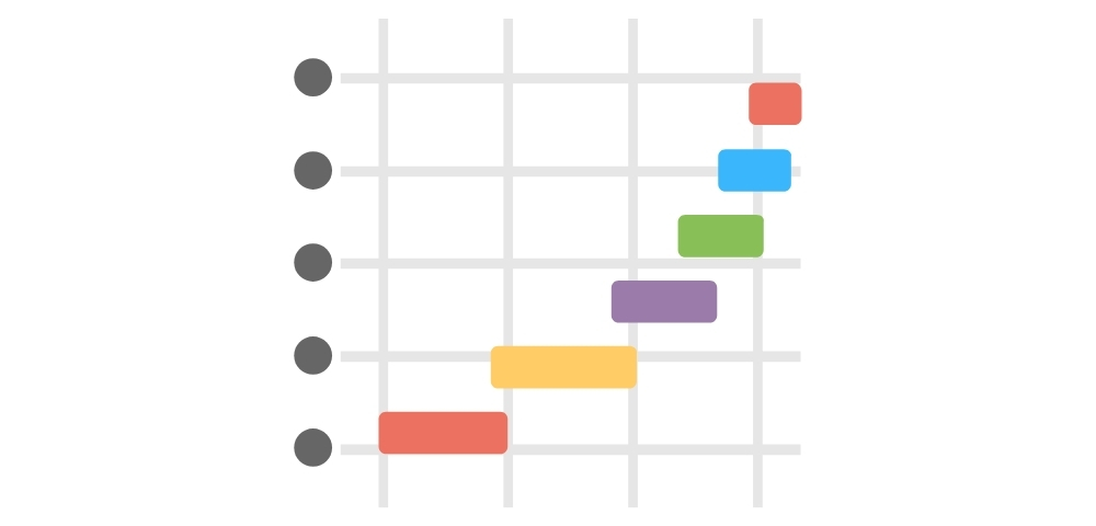
One of the most often used project management charts is the Gantt chart. It lets project managers monitor job progress over time and shows project timeframes.
Gantt Charts; in a way, it is sort of laying a foundation for developing project schedules. Not to forget that scheduling is an indispensable component of every project plan.
It is not so confusing, as a Gantt chart is easy to understand. It is popular as a simplified version of a bar chart. It showcases project tasks on the vertical axis and time in days or weeks on the horizontal axis. Gantt Chart’s speciality is that it unifies all the data required for a project team under one space and boosts productivity eventually.
Pie Chart
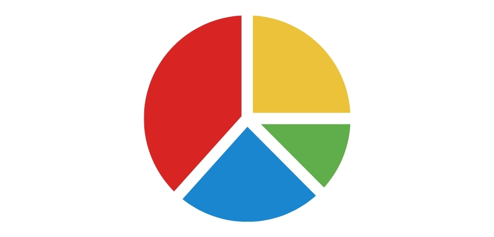
A project pie chart is a rounded graph that shows the contributions of various project resources to the project as a whole. Since they offer a useful means of illustrating project progress in relation to scheduled tasks, pie charts are frequently used for project planning and tracking.
For instance, if we wish to display the percentage contribution of each team member to meeting deadlines or budgets, we can utilise such a type of project management tool. It is possible to graphically depict each person’s contribution to the success of your project by using a pie chart.
The primary function of a pie chart is to show the numerical proportions of several groups that constitute a whole. This kind of graphic is one of the simplest data visualisation techniques available for project management at all complexity levels.
Pie charts seem to work well in every situation. However, there is a single restriction that limits their application. An overabundance of categories makes the pie chart cluttered, making it hard to understand the ratios at a glance.
Flowchart
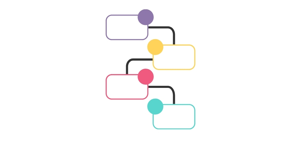
A project flowchart is known as a graphic representation of the project tasks and how they relate to each other at every stage of the project.
As this indicates the entire project flow through a sharp and straightforward manner, PMs find it valuable in the project execution.
You could more effectively visualise your projects by using a flowchart, which breaks down information into phases so that all project participants are always aware of their current status. This is a good strategy for your teams, as they get the chance to identify any issues or roadblocks in their jobs.
The sole purpose of utilising this type of chart in a project has two major reasons. One is that it smoothly expedites procedures without making grudges. Then, the project flowchart simply works towards better compliance with corporate policies or industry-related laws.
Since this is an outstanding method to record the reasoning, many PMs tend to employ it within their projects. It is quite easy to share it with clients, investors and legal bodies.
The best benefit is that it illustrates what is going on and what will occur in each project stage clearly.
PERT Chart
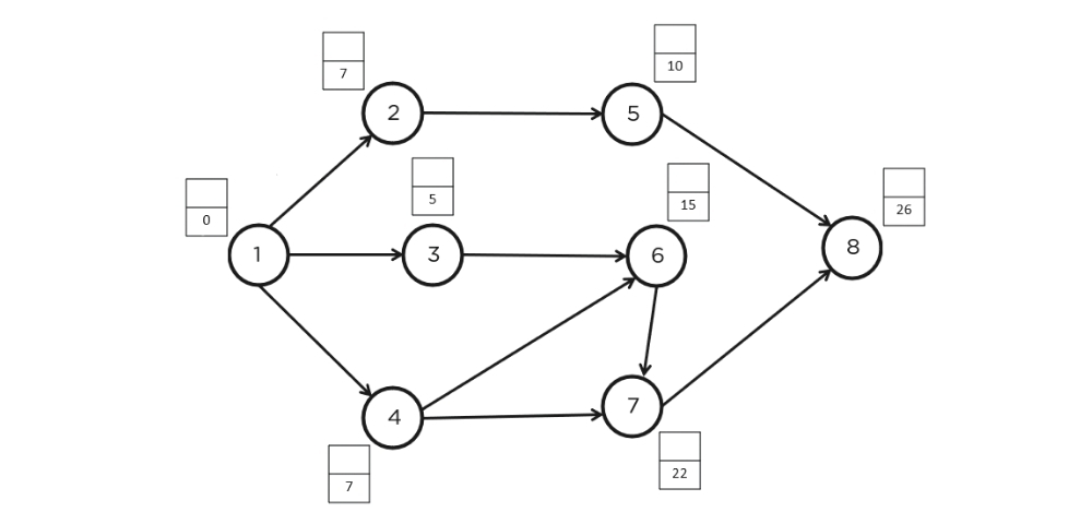
One particular kind of project network diagram, which is a great tool for visualising project activities and hazards, is the PERT project management chart.
When developing project schedules, a PERT chart can function as a foundation to assist you in choosing the most effective plan of action while guaranteeing adherence to organisational deadlines.
If you want to develop a PERT Chart, you must have the following components: A list of your project’s tasks (with projected durations), task dependencies amongst each other, and expected completion dates for all project activities. The end product is a simple flowchart that illustrates how various project components are dependent upon one another in terms of the amount of time or resources needed.
Pareto Chart
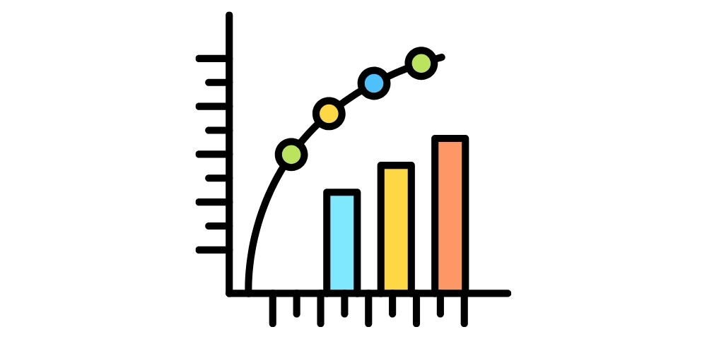
A Pareto chart is a combination of a line graph and a bar graph. You could employ this chart to draw attention to certain parts of your project. It is common practice to use Pareto charts to identify issues and challenges in a project.
In the project management realm, proactive thinking receives utmost importance. The project teams believe that it is always better to prevent the possible negative outcomes in advance rather than damage control or applying problem-solving mechanisms after every damage occurs.
This sort of charts allows the teams to comprehend the most common causes of problems. This way, you can implement various strategies to stop them at the basic levels.
Burn Up Chart
A project burn-up graphic is sometimes called a cumulative flow diagram. By facilitating the identification of any problems before they become more serious, this project management tool enables you to keep an eye on the status of your project.
The key objective of adopting this form of project planning software is to monitor work items throughout the development process, including their start and completion dates, percentage complete, and so on. You can monitor how much time you have spent on each activity or job over time using this project management spreadsheet.
You can take advantage of your prepared burn-up charts on an ongoing basis, both at the milestone level and inside individual tasks, to quickly understand which areas require additional effort and resources, as well as where delays may be expected.
For a single perspective of the total amount of effort and finished work, you can employ a burn-down chart. While the horizontal axis of the graph shows the time period, which can be expressed in hours, days, or weeks, the vertical axis usually shows the number of tasks or quantity of labour.
As a manager, burn-up charts are quite useful for tracking how quickly activities are finished. Not only that, but the knowledge will help you make your project plan better and make it more effective.
What is the Purpose of a Project Chart?
Improved Visualisation
Charts make progress easier to grasp by converting complicated project data into understandable images.
Better Time Management
They help in keeping the project on track as they have features to track timings, deadlines, bottlenecks and everything in advance as well as in real-time.
Effective Resource Allocation
Managers can efficiently distribute resources by using charts that show the distribution of workload.
A Greater Level of Collaboration
Since these charts offer higher levels of transparency, the team members are aware of their tasks, the progress of each department and what they need to focus on next, etc.
Early Identification of Risks
Teams can spot delays or bottlenecks early and modify their tactics by visually monitoring performance.
Making Way for Successful Project Completion via Top Tools
You may understand that a successful project is not all about handling resources well. It is much bigger than that. On a path where you see a successful project completion, you may need various project charts to boost the visibility and enhance communication among teams. Tigernix makes this easy for you by offering a robust Project Management System that can allow the implementation of any type of visual representation on its dashboard. With our software solution, all data is centralised, visually displayed and converted into reports in real-time!